Choosing the right colours and fonts for your estate agency emails may seem like a small detail, but it can make a big difference in how your emails are perceived and how well they perform.
The combination of colours and fonts affects the readability, branding, and overall professionalism of your emails. Using the wrong colours can distract or overwhelm your audience, while hard-to-read fonts may cause recipients to ignore your message altogether.
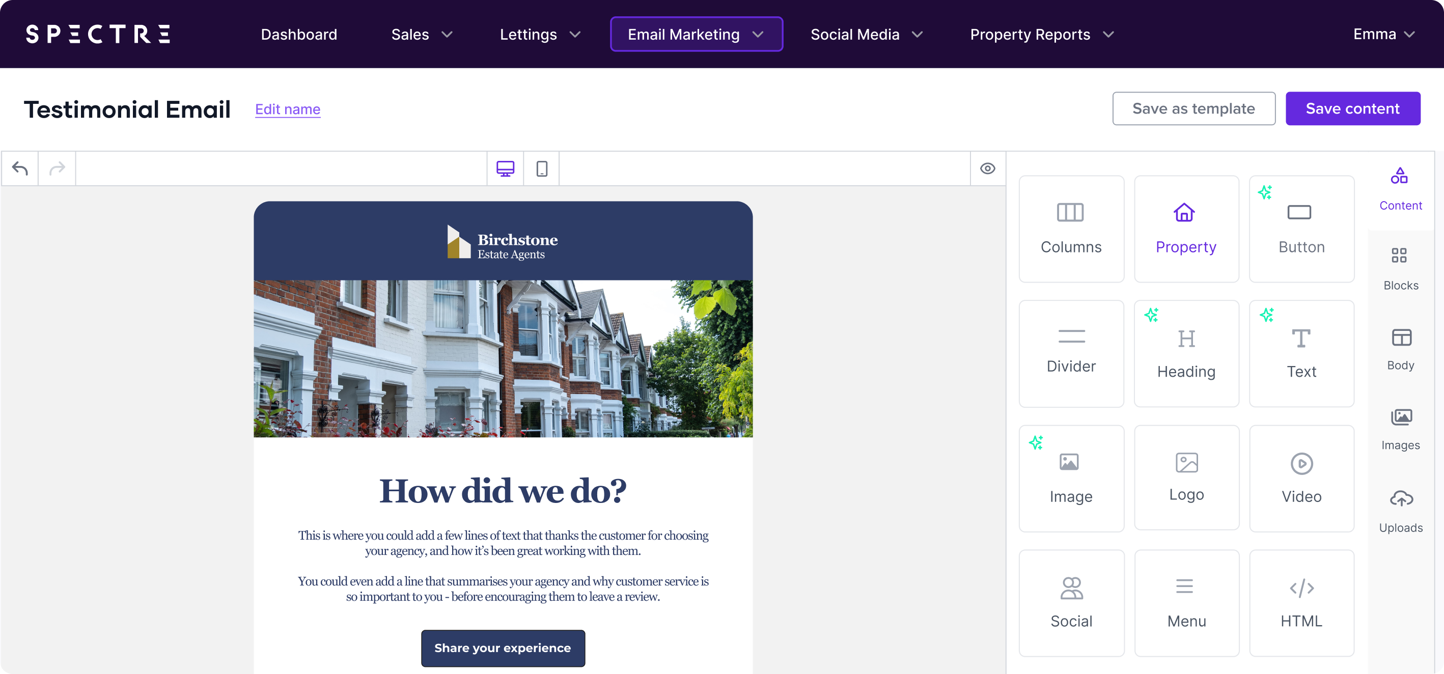
In this part of the series, we’ll break down the key Do’s and Don’ts of selecting colours and fonts for your estate agency emails, helping you create designs that are visually appealing, professional, and effective.
Do: Stick To Your Brand Colours
Consistency is key when it comes to branding, and your email marketing should reflect your estate agency’s brand identity. Stick to the colours that are part of your agency’s brand palette—these are the colours your audience associates with your business, making your emails instantly recognisable and building trust over time.
Tip: Use your primary brand colour for major elements like the header or buttons and secondary colours for accents or background sections. This keeps your emails consistent with your other marketing materials, like your website and brochures, and helps reinforce your brand image.
Don’t: Use Too Many Colours
While it’s important to use your brand colours, too many colours can make your emails look cluttered and overwhelming. An email with multiple contrasting colours can confuse readers and make it difficult for them to focus on the main message, it can also have accessibility issues.
Tip: Stick to a colour scheme that uses no more than two or three main colours. A primary colour (often your brand’s main colour), an accent colour for CTAs, and a neutral background colour work well together. For example, use a clean white or light grey background with a primary colour for text headers and an accent colour for buttons.
Do: Ensure High Contrast for Readability
Readability is one of the most important factors in email design. Your text must be easy to read on all devices, and this means having a high contrast between your background and font colours. Black text on a white background is the gold standard for readability, but other combinations, like dark text on light backgrounds, can work as well.
Tip: Test your colours to ensure there’s enough contrast. You can use online tools like WebAIM’s Contrast Checker to make sure your colour combinations meet accessibility standards. For estate agents, where attention to detail is important, ensuring your emails are easy to read on all screens and email clients is essential.
Don’t: Use Bright Colours for Text Blocks
Bright, neon colours might grab attention, but they can also be hard on the eyes—especially in large blocks of text. If your audience finds it difficult to read your email, they’re likely to close it quickly, which means your message won’t get through.
Tip: Reserve bold, bright colours for elements like CTAs or small accents. Stick to more neutral or muted colours for the main body text to ensure readability.
Do: Use Web-Safe Fonts
Not all fonts are created equal when it comes to email rendering. Some fonts may look great on one platform but fail to load properly on others, especially if your recipients are using older email clients or mobile devices. Web-safe fonts are standard fonts that work well across all platforms and devices.
Tip: Stick to web-safe fonts like Arial, Helvetica, Georgia, or Verdana for your main text. These fonts are widely supported across all email clients and ensure that your email will look consistent, no matter where it’s opened.
Don’t: Use Too Many Different Fonts
Consistency in font choice is as important as consistency in colour. Using too many different fonts can make your email look disorganised and unprofessional. If your email has more than two different fonts, it can confuse the reader and detract from the overall message.
Tip: Stick to two fonts at most—one for your headlines and one for your body text. Make sure both fonts complement each other and are easy to read. For instance, pairing a bold, serif font like Georgia for headlines with a simple sans-serif font like Arial for body text can create a balanced, professional look.
Do: Make Your Fonts Large Enough to Read
Font size is another crucial factor in readability. Emails are often viewed on mobile devices with smaller screens, which means your fonts need to be large enough to be easily read without zooming in. Tiny fonts can frustrate your readers and cause them to abandon your email.
Tip: For body text, aim for a font size of at least 14-16px. For headlines, go larger—around 18-20px. This ensures your text is legible on both mobile and desktop. Also, test your email across devices to make sure the font sizes are appropriate for different screen sizes.
Don’t: Use Decorative Fonts for Body Text
While script or decorative fonts can add flair to your design, they should be used sparingly. These fonts are often difficult to read in long paragraphs or smaller sizes, especially on mobile devices. They may look attractive in a logo or banner, but they shouldn’t be used for body text or key information.
Tip: Reserve decorative fonts for small areas like headlines or special promotions. Ensure that your main text is always set in a clean, easy-to-read font.
Do: Highlight Important Information
When you need to draw attention to key information in your email—like property prices, deadlines for offers, or the date of an open house—use bold text or a different colour to make it stand out. Highlighting the right elements ensures your audience notices what’s most important at a glance.
Tip: Use bold or coloured text sparingly. Too much bold or too many different colours can overwhelm your reader. Save this technique for key elements like CTAs or important dates.
Don’t: Use All Caps for Large Text Blocks
Using all capital letters for long sections of text can feel overwhelming and is often perceived as shouting. It can also be harder to read than mixed-case text. Reserve all caps for small areas where emphasis is needed, such as CTAs or headers.
Tip: Use sentence case or title case for most of your text. If you want to emphasise a particular word or phrase, bold or colour it instead of typing it in all caps.
Choosing the right colours and fonts for your estate agency emails is more than just a design decision—it’s about creating a professional, cohesive experience that drives engagement.
By following these do’s and don’ts, you can ensure your emails are easy to read, consistent with your brand, and visually appealing.
Stay tuned for the next blog in this series, where we’ll explore the Do’s and Don’ts of Email Functionality to ensure that your emails not only look good but also perform well across all devices and platforms.
For now, take some time to review your current email designs and consider how you can refine your colour and font choices to improve readability and engagement. If you’d like to take a look at Spectre Email and how it can help you create best-in-class emails, book a demo today!