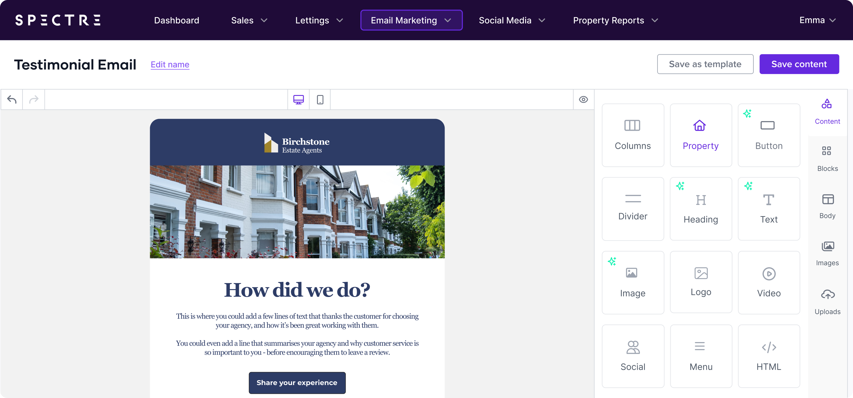
Visuals are one of the most powerful tools in email marketing.
Whether you’re promoting new property listings, showcasing testimonials, or sharing market insights, the images and visuals you choose can make or break your email’s effectiveness.
A good, relevant image can grab attention, convey essential information quickly, and create an emotional connection with your audience. On the other hand, irrelevant or poor quality visuals can confuse readers or cause technical problems, leading to a drop in engagement.
In this next part of the series, we’ll cover the key do’s and don’ts when it comes to using visuals in your estate agency emails, ensuring that every image and design element enhances your email rather than detracts from it.
Do: Use High-Quality Property Images
As an estate agent, your emails should always include high-quality, professional images of the properties you’re promoting. These visuals are the first thing your audience will notice, and they need to grab their attention.
Clear, well-lit images showcasing a property’s best features (like spacious kitchens, beautiful gardens, or newly renovated interiors) will always outperform grainy, low-resolution images.
Tip: Choose high-resolution images that focus on the most attractive elements of the property. Avoid cluttered or unappealing shots. If possible, hire a professional photographer or invest in equipment that can capture high-quality images.
Don’t: Use Large Images Without Compression
While high-quality images are essential, large image files can slow down your email’s load time. If your email takes too long to load, recipients are likely to delete it before they even see your content. Optimise your images by compressing them without sacrificing too much quality.
Tip: Use tools like TinyPNG to compress your images before uploading them into your email. This will help reduce load time and ensure that your email delivers quickly to recipients.
Do: Use Alt Text For Every Image
Alt text (alternative text) is a description of an image that appears when the image doesn’t load or when your audience has accessibility needs. Many email clients, including Outlook, disable images by default, so your recipients may not see your images unless they manually choose to load them. Alt text ensures that even if images aren’t displayed, the recipient still gets the core message of your email.
Tip: Write concise, descriptive alt text for every image. Instead of saying "Image of property," describe what’s in the image: "Spacious 4-bedroom family home with a large garden." This ensures that even if images are blocked, your email still conveys important information.
Don’t: Rely Use Background Images
While background images can enhance the visual appeal of an email, they can also be problematic in certain email clients—especially Outlook. Many email clients either block or don’t render background images properly, which can break your email design and leave your message looking incomplete. Instead, use solid background colours to ensure your email renders properly across all platforms.
Tip: Use a background colour that matches your brand to enhance the visual appeal of your email and create better brand recognition with your audience.
Do: Mix Visuals & Text for Balance
It’s important to strike a balance between visuals and text in your emails. While images are essential for showcasing properties and breaking up blocks of text, emails that rely solely on images without any text can come across as overly promotional and may be marked as spam by some email clients.
Tip: Use a mix of visuals and text to convey your message. For example, pair a property image with a short description and a clear CTA. Tools like Spectre Email’s image and text CTA blocks allow you to seamlessly integrate both elements into a cohesive layout.
Don’t: Use Text Within Images For Important Information
Any important information, such as property prices, address details, or CTA links, should be written in text, not embedded within an image. Many email clients don’t load images automatically, and if your key information is part of the image, your recipients won’t see it.
Tip: Ensure all essential information is in HTML text, even if you’re also displaying it as part of an image. That way, your message is clear, even if the images don’t load.
Do: Test Your Images In Different Email Clients
Email clients render images differently. An email that looks perfect in Gmail might look completely different in Outlook or Apple Mail. Some email clients may automatically resize images, stretch them, or block them altogether. Testing your email across multiple platforms ensures that your visuals are displayed correctly, no matter which client your recipient is using.
Tip: Use Spectre Emails preview tool to see how your email will look on various devices and email clients before sending. This helps you identify any rendering issues ahead of time and fix them before your campaign goes live.
Don’t: Overload Emails With Images
While images are important, overloading your email with too many visuals can make it feel cluttered and overwhelming. It can also slow down your email’s load time, which increases the likelihood that recipients will abandon it before it fully loads. Keep your email design clean and simple, using images strategically to enhance the message, not overwhelm it.
Tip: Limit yourself to a few key images that support the primary goal of your email. If you’re showcasing multiple properties, use a property block layout to organise them neatly without overwhelming the reader.
Do: Create A Visual Hierarchy
A clear visual hierarchy helps guide your reader through your email and ensures they see the most important information first. The main image, such as a featured property, should be the focal point, followed by secondary visuals that support your message. A good visual hierarchy ensures your email is easy to scan and that your key message is delivered effectively.
Tip: Place your most important images (such as featured properties or key CTAs) at the top of the email, where they’ll be seen first. Use smaller, less prominent images for secondary content further down the email.
Don’t: Ignore Image Consistency
Using images with wildly different styles, sizes, or tones can make your email feel disjointed and unprofessional. Ensure that all images in your email share a consistent style, colour scheme, and tone to create a cohesive look that reflects your brand.
Tip: If you’re using multiple images in one email (e.g., for multiple property listings), ensure they are all edited in the same style, with similar lighting and composition. This consistency will make your email look polished and professional.
Using visuals effectively in your estate agency emails is about more than just throwing in a few property images. It’s about creating a balanced, cohesive design that enhances your message and drives action. By following these do’s and don’ts, you’ll be able to create visually appealing emails that not only look great but also convert.
Stay tuned for the next blog in this series, where we’ll explore the Do’s and Don’ts of Colours & Fonts in email creation. For now, make sure your visuals are optimised by using tools like Spectre’s email design features to simplify the process and ensure your emails look stunning across all platforms. Book your demo today!