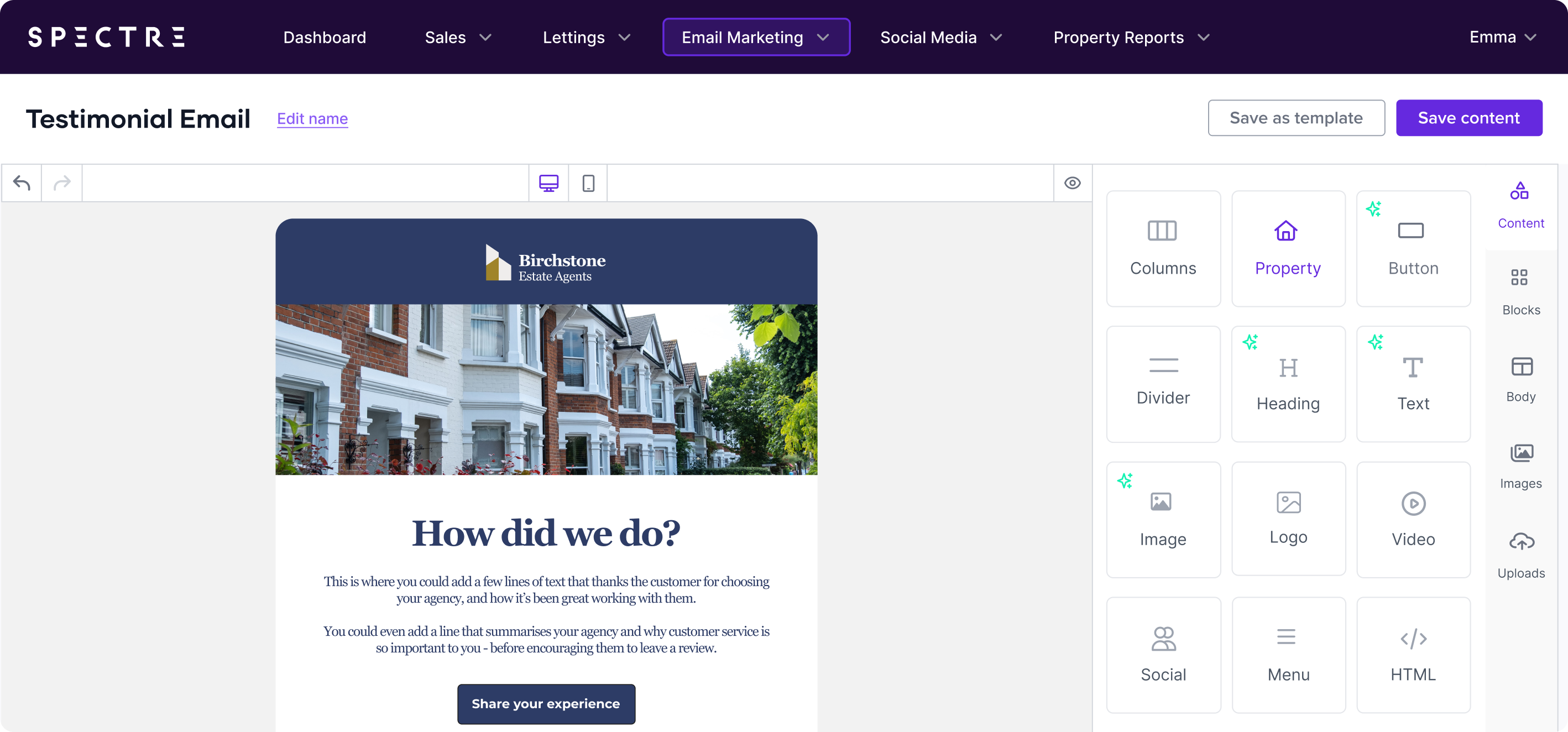
When it comes to email marketing, how your email is laid out can be just as important as the message you’re delivering.
A well-structured, clean design makes it easy for recipients to engage with your content, while a cluttered or poorly thought-out layout can cause confusion and lead to lower engagement rates.
For estate agents, where emails often include visuals like property listings or market updates, getting the layout right is essential to driving conversions.
We’ll explore key Do’s and Don’ts of email layout design that will help you create emails that are visually appealing, easy to navigate, and drive results.
Do: Use A Mobile-First Design
55% of emails are opened on mobile devices, which means your design needs to work well on small screens.
A mobile-first design ensures that your emails are easy to read, scroll, and interact with on smartphones and tablets.
Tip: Keep columns to a minimum (1-2 for mobile) and make sure buttons and CTAs are large enough to tap easily on a touchscreen.
Don’t: Overcomplicate The Layout
Complex layouts with too many columns, blocks, or overlapping elements can confuse your readers and cause them to miss important details. Stick to a clean, simple structure with distinct sections for text, images, and calls-to-action (CTAs). Remember, the goal is to guide the reader through the content, not overwhelm them.
Tip: Use white space strategically to separate sections and make your email more digestible. A cluttered email can feel overwhelming, so give your content room to breathe.
Do: Use Visual Hierarchy To Guide Readers
One of the key principles of good design is visual hierarchy, which refers to the way your content is structured to lead the reader’s eye through the email. For example, your headline should be the most prominent element, followed by the key image, and then the body text. This helps the reader quickly understand the most important points.
Tip: Use larger font sizes for headlines and clear, high-contrast colours for important CTAs. You can also play with the size and positioning of images to create a natural flow for the reader.
Don’t: Rely On One Layout For Every Email
While consistency is important for branding, using the same layout for every single email can make your campaigns feel stale. Mix things up by using different templates depending on the message you want to send.
For example, you can use a property spotlight template that is a more visual-heavy layout, while a newsletter might focus more on a text-based structure with accompanying images.
Tip: Use Spectre’s built-in template gallery to choose from various layouts designed specifically for estate agents, such as the Property Spotlight or Newsletter templates. This way, you can keep your emails fresh while maintaining a consistent look and feel.
Do: Use Clear Calls-To-Action (Ctas)
Every email you send should have a clear purpose, and your CTA should reflect that. Whether you want the recipient to schedule a viewing, request a valuation, or browse properties, your CTA should be easy to spot and action-oriented. Place your main CTA near the top of your email (above the fold) and repeat it at least once further down for longer emails.
Tip: Use buttons instead of text links for your CTAs, as they are more visually prominent and easier to click on both desktop and mobile devices. Bold, high-contrast colours for your buttons will make them stand out.
Don’t: Overload With Multiple Ctas
While it’s tempting to include several CTAs—after all, you want your recipients to take action—it’s important to focus on one primary action per email. Too many competing CTAs can confuse the reader, diluting the message and lowering the chances of any single action being taken.
Tip: Stick to one primary CTA per email. If you do include secondary CTAs (such as links to social media or additional resources), make sure they are visually less dominant than the main action you want recipients to take.
Do: Design For Scanability
Most recipients won’t read your email word-for-word. Instead, they’ll scan it quickly to pick up on key points. Structuring your email to be easily scannable increases the chances that important information will be noticed.
Tip: Use headings, subheadings, and bullet points to break up the text and make the email more scannable. Make sure your images are spaced out so they don’t overwhelm the text.
Don’t: Forget To Test Across Devices And Platforms
What looks great in one email client might not render properly in another. Some email clients, especially Outlook, handle HTML and CSS differently, meaning your beautifully crafted design could break or display incorrectly. Testing across devices and platforms ensures your email looks good no matter where it’s opened.
Tip: Before sending, use Spectre’s preview tool to test how your email looks on both desktop and mobile. Additionally, send test emails to check rendering across popular email clients like Gmail, Apple Mail, and Outlook.
Do: Stick To Readable Font Sizes
It can be tempting to use small fonts to fit more information into your email, but readability should always come first. If recipients have to squint or zoom in to read your email, they’re likely to give up and delete it instead.
Tip: For body text, a minimum of 14px is recommended, while headlines should be at least 18px. Make sure there’s enough contrast between the text and the background colour to ensure readability on all devices.
Don’t: Use Too Many Fonts
Using multiple fonts can make your email look inconsistent and unprofessional. Stick to one or two fonts at most to keep your design cohesive.
Tip: Choose a simple, web-safe font like Arial or Helvetica for the body text, and use a complementary font for headings. Avoid using decorative fonts that might be hard to read, especially on mobile devices.
The design and layout of your emails play a crucial role in how recipients engage with your content. By following these do’s and don’ts, you’ll be able to create clean, professional-looking emails that are not only visually appealing but also effective at driving action.
Remember, a well-designed email doesn’t just look good—it guides the reader toward the desired outcome, whether that’s booking a viewing, requesting a valuation, or exploring your latest listings.
Stay tuned for the next blog in our series, where we’ll dive into the Do’s and Don’ts of Visuals in email creation. For now download our latest guide on "What Agents Should Be Sending in 2025" or book your demo today!